Friday, June 1, 2007
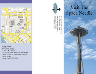
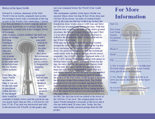
Tri-Fold
In this assignment we had to create a trifold for an event or place. I chose to make my Tri-fold about the Space Needle. I got a good a grade on this one so i figure i didn't do that bad. This wasn't made in photoshop, I used InDesign for this one. All that text is about the history of the Space Needle. The rest is a map and address with a registration form to recieve more info. please don't use the registration form because i made it up and it isn't real.
Ugly Peepling
This assignment was about Peeps. Those little marshmallow things covered in a layer of sugar. They usually come in Pink and yellow and are in the shape of bunnies or duck-like things. Well I used the Ugly duckling and just changed the picture of the Ugly Duck to a Pink Peep. Yeah it was sort of rushed so it didn't turn out so good.
Red Vs. Blue
This is something I made that i thought looked pretty cool. I called it Red Vs. Blue.
This tutorial is how i made the lightning in the background:
http://www.tutorialized.com/view/tutorial/Clouded-Lightning/23361
To create the red and blue balls i went to filter>Render>clouds and than >filter>distort>spherize. I put the Spherize on max and than cut out the center ball. I just changed the colors and added the white lines to look like the balls were "cracked" or "shattered."
Silk Screen
This assignment we were only allowed to use 4 colors because that is the number of colors you can use when your silk screening a design onto a shirt. I found this picture of a Phoenix but it was all pink and purple so i decided to change that to something that seemed more appropriate. For some reason the colors won't show up anymore....
Greeting Card
Film Festival
One last poster for school. This one was for the Film Festival. I tried to make it look like a film strip ( with the black border along the outside). Once again this design wasn't picked but Carl's was (check my links for Carl's Blog). That was pretty cool because Carl put a picture of me on his poster and now it's hanging up all over the school.
Battle of the Bands
This is another poster i had to creat to advertise an event at school, The Battle of the Bands. Of course my poster wasn't picked, no surprise. This was the same technique used to create the Art Expo poster. Something to do with Threshold. If you want to make some parts show up a bit clearer it really helps to use the burn tool. That's what i used on the amps in the back.
Subscribe to:
Posts (Atom)